01/04
Fidelity ONE MEDICAL ESSENTIAL BLENDS WINE PACKAGING

CLIENT

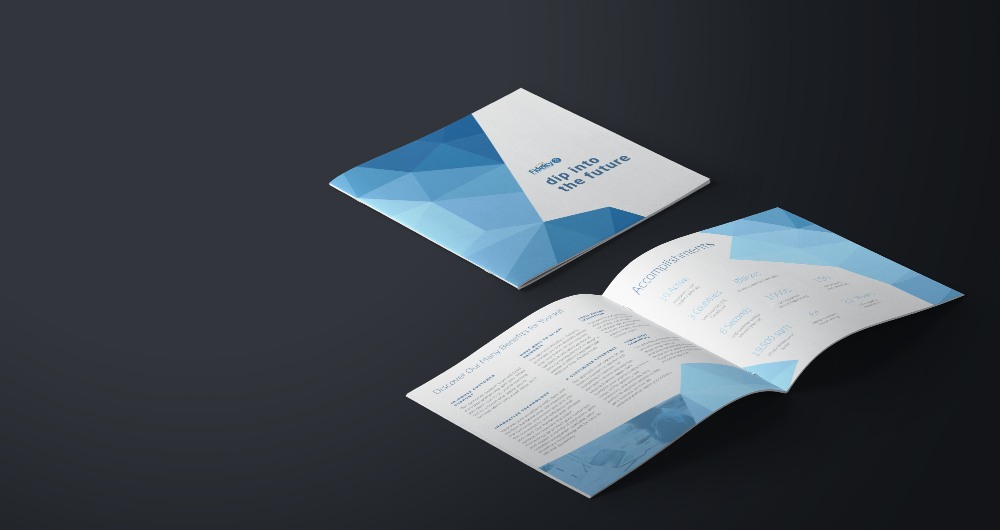
Fidelity believes in making the complex, simpler—whether clients work with them in person, on the phone, or online. From investing to financial planning and pricing, their goal is to be straightforward and help with your unique needs. With low minimums, no annual account fees, and competitive pricing on trades and transactions, you’ll always know what you’re paying with Fidelity.

PROJECT

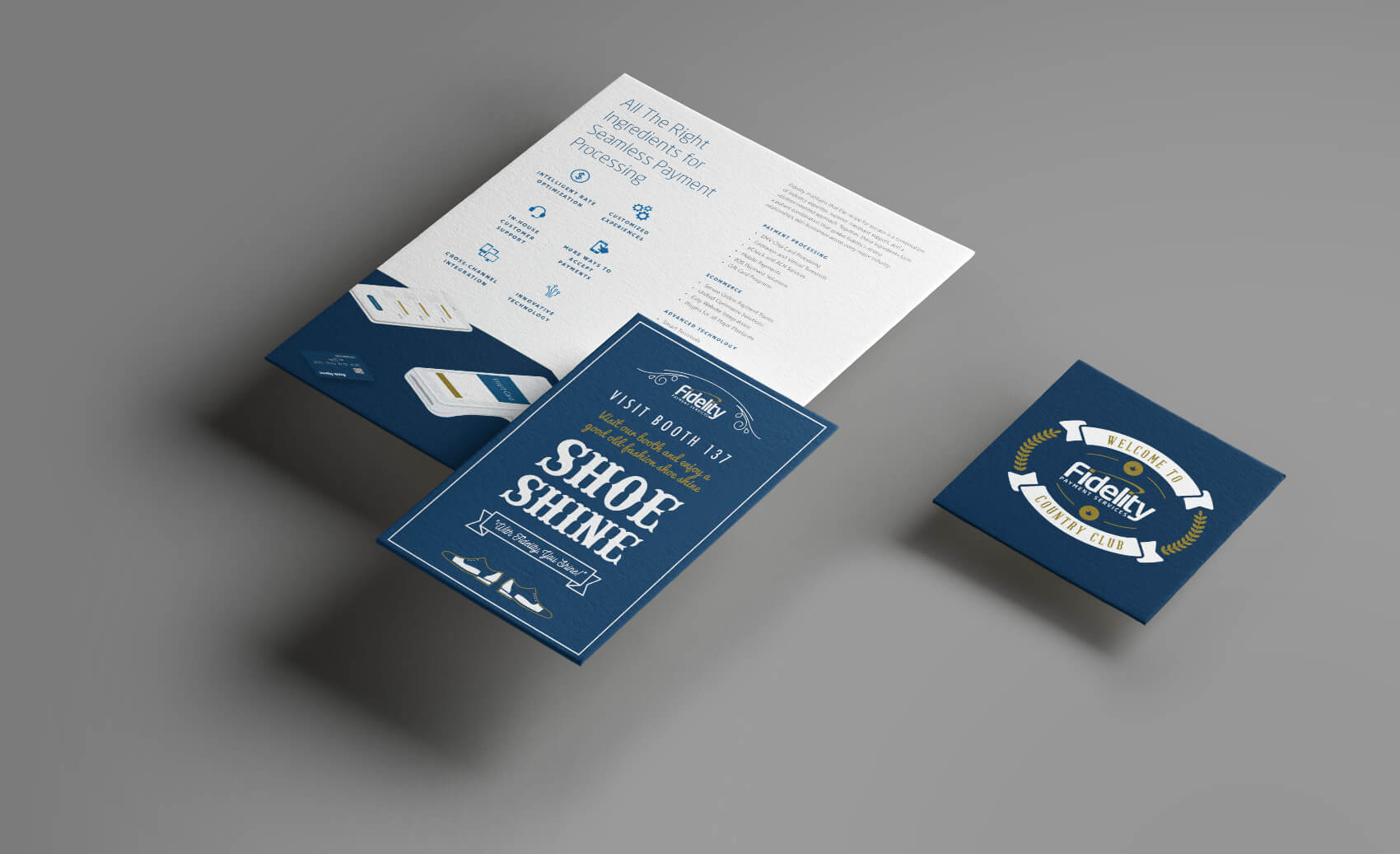
Starting in 2016, Fidelity came to me in need of brochures for worldwide conference events. I was able to jump on board with the assets they provided to create visually compeling designs that conveyed their message. The focus on the brochures was creating simple, clean and stunning graphics that lived up to Fidelity’s brand.

CLIENT

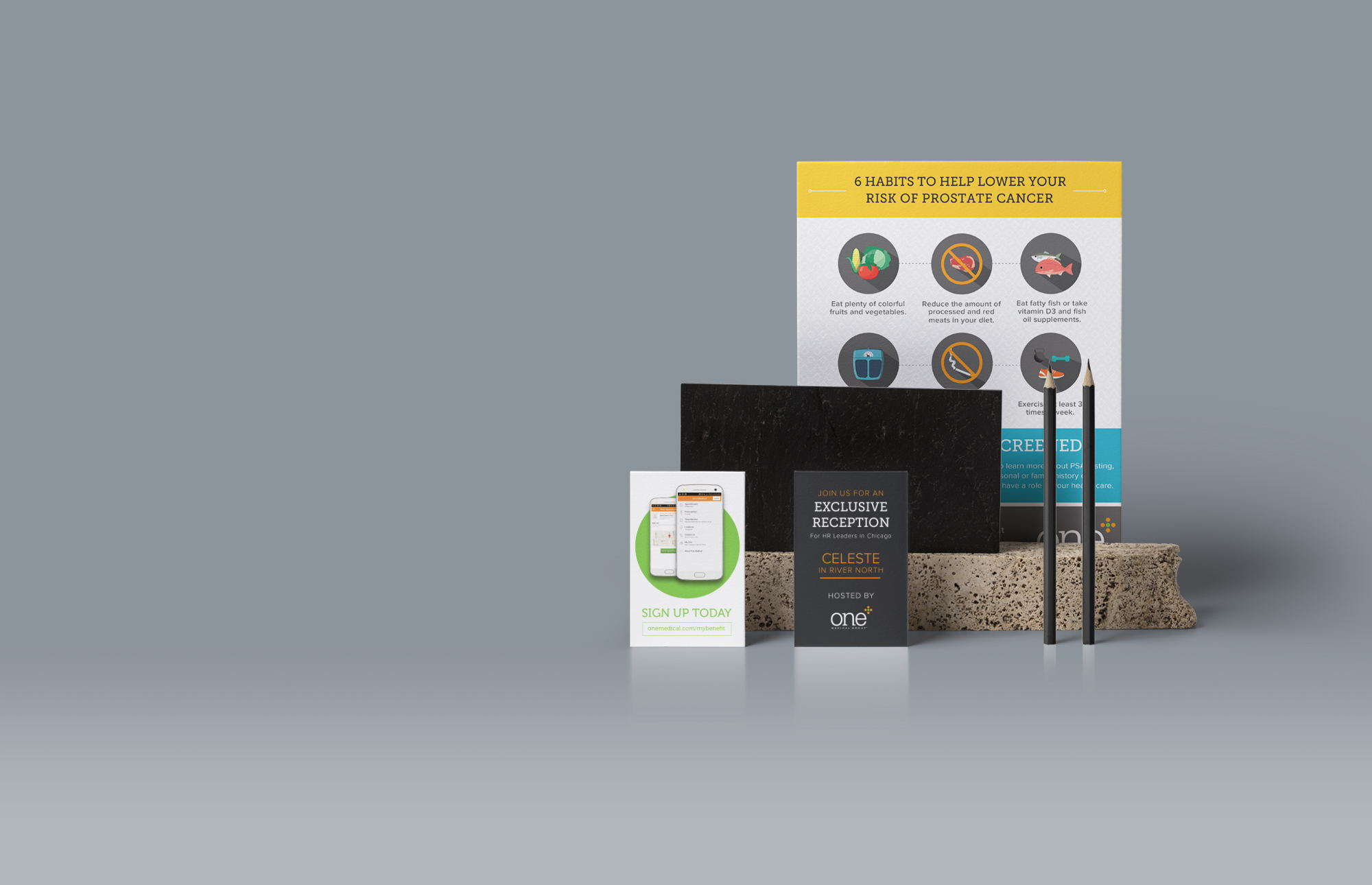
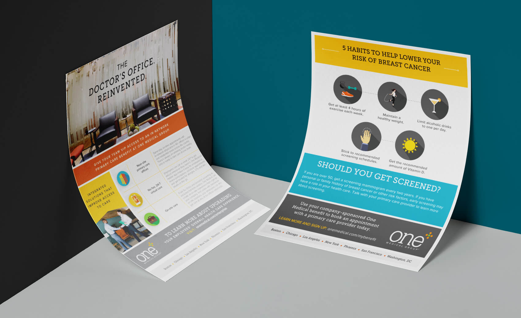
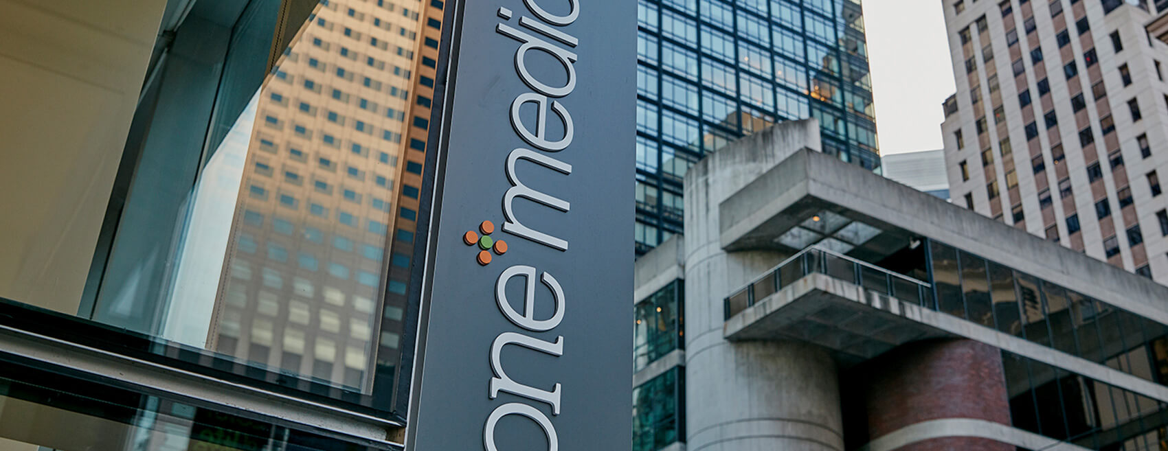
One Medical challenges the notion that delivering high-quality, accessible health care is either unachievable or prohibitively expensive. In fact, they are working to prove that just the opposite is possible. To bring this vision to life, One Medical relies on people-centered design, smart application of technology, and a team of talented primary care providers who have the time and tools to make the right decisions.

PROJECT

As an already established company – One Medical was in need of flyers, email blasts, social media posts and other print materials to reflect their authentic brand. I was involved with creating print materials for One Medical events in Chicago and San Francisco. This also includes online graphics that were used worldwide.

CLIENT

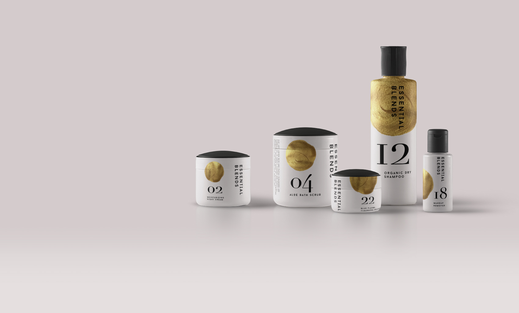
The products on our shelves are all lovingly handmade by devoted compounders who slice, squeeze and mix up fresh batches every day of the week. Our commitment to handmade doesn’t stop there, because our shops are carefully handcrafted too. Ever since our humble beginnings, handmade has been a part of our story. It’s not just part of our name; it’s part of who we are.

PROJECT

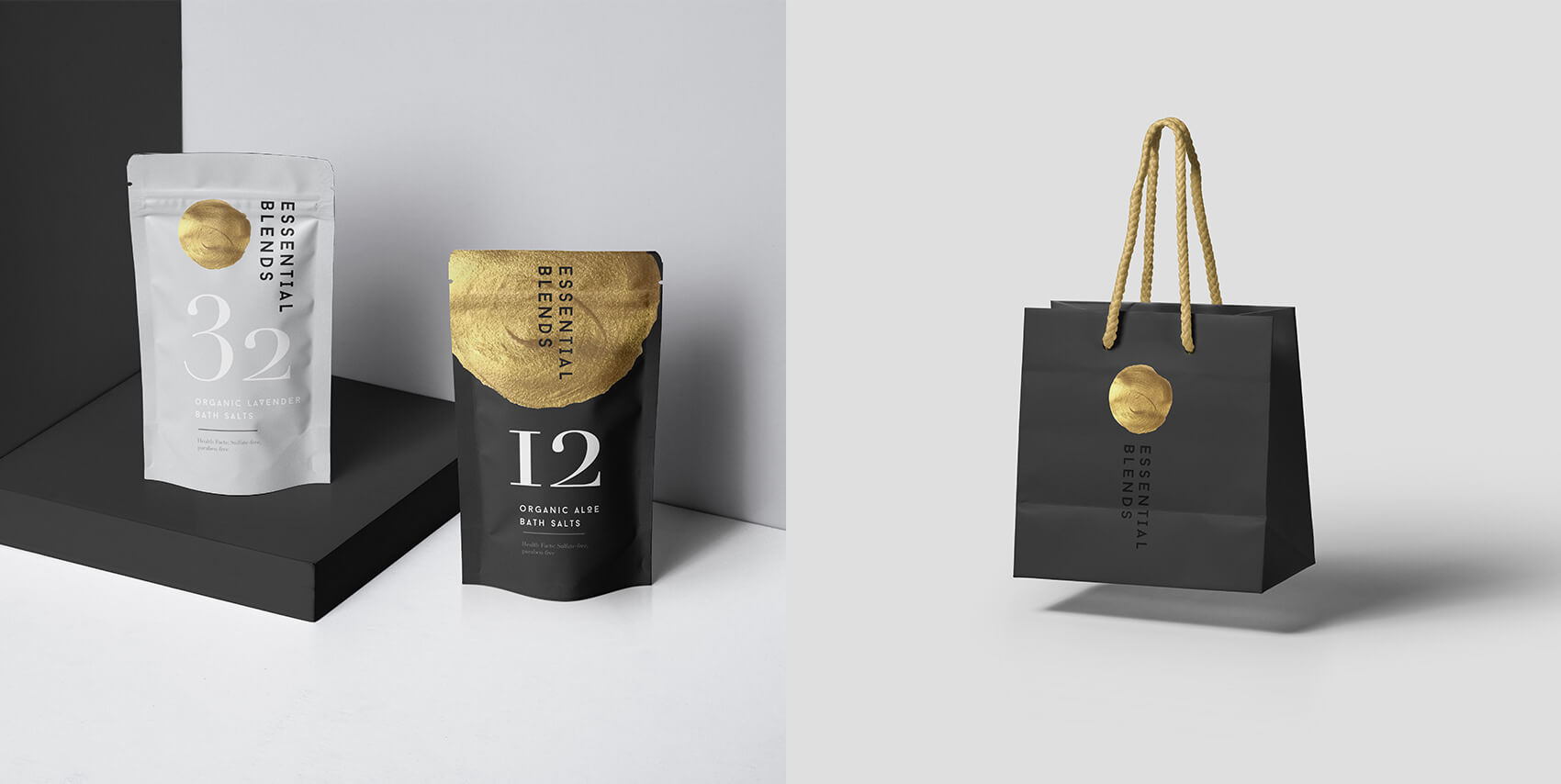
Minimalism is key to the Essential Blends brand. Playing around with the brand’s iconic gold circle has been an exciting way to add a new texture element. I focused on clean and beautiful typography and created lots of white space in my packaging labels.

CLIENT

Fidelity believes in making the complex, simpler—whether clients work with them in person, on the phone, or online. From investing to financial planning and pricing, their goal is to be straightforward and help with your unique needs. With low minimums, no annual account fees, and competitive pricing on trades and transactions, you’ll always know what you’re paying with Fidelity.

PROJECT

Starting in 2016, Fidelity came to me in need of brochures for worldwide conference events. I was able to jump on board with the assets they provided to create visually compeling designs that conveyed their message. The focus on the brochures was creating simple, clean and stunning graphics that lived up to Fidelity’s brand.

Fidelity

CLIENT

One Medical challenges the notion that delivering high-quality, accessible health care is either unachievable or prohibitively expensive. In fact, they are working to prove that just the opposite is possible. To bring this vision to life, One Medical relies on people-centered design, smart application of technology, and a team of talented primary care providers who have the time and tools to make the right decisions.

PROJECT

As an already established company – One Medical was in need of flyers, email blasts, social media posts and other print materials to reflect their authentic brand. I was involved with creating print materials for One Medical events in Chicago and San Francisco. This also includes online graphics that were used worldwide.

ONE MEDICAL
website coming soon Next Project

CLIENT

The products on our shelves are all lovingly handmade by devoted compounders who slice, squeeze and mix up fresh batches every day of the week. Our commitment to handmade doesn’t stop there, because our shops are carefully handcrafted too. Ever since our humble beginnings, handmade has been a part of our story. It’s not just part of our name; it’s part of who we are.

PROJECT

Minimalism is key to the Essential Blends brand. Playing around with the brand’s iconic gold circle has been an exciting way to add a new texture element. I focused on clean and beautiful typography and created lots of white space in my packaging labels.

ESSENTIAL BLENDS
website coming soon Next Project

WINE PACKAGING
Awwwards